What the Watercolor style looks like
Watercolor is defined as much by what it leaves out as by what it paints.
- White space. Much of the paper stays white. The background becomes a soft hint of color or nothing at all, so the pet floats on the page.
- Soft washes. Fur is painted in transparent layers of pastel color. Detail gathers around the eyes, nose and ears, and fades toward the edges.
- Ink accents. A few fine dark lines define the eyes and the outline, which keeps the portrait from looking blurry.
- Your pet's real colors. The palette follows the coat in your photo, just lighter and airier.
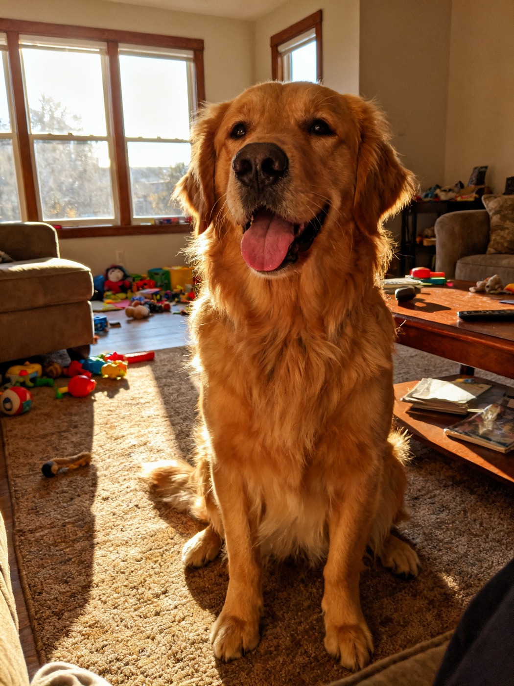 The phone photo Goldie's portraits started from
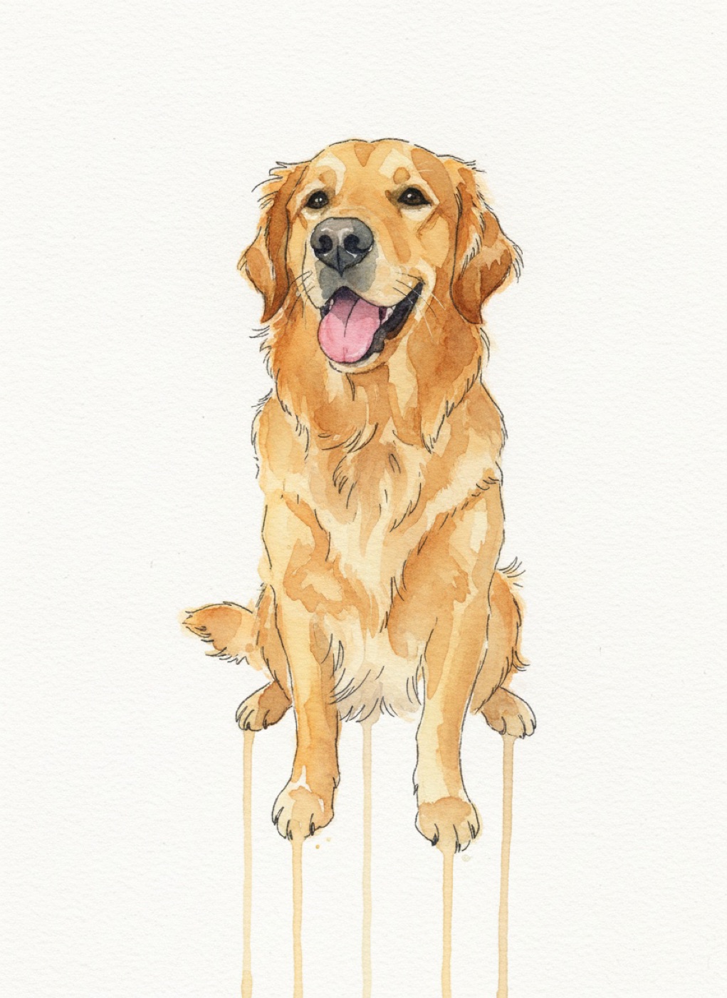 Style sample: Goldie, a golden retriever, in the Watercolor style
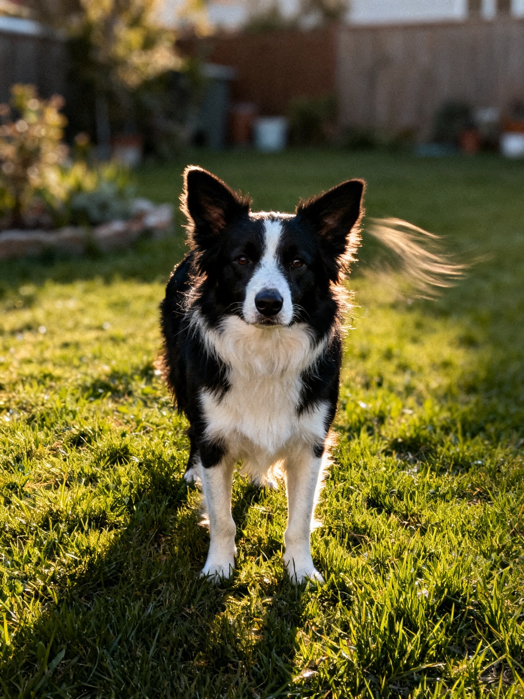 The phone photo Pepper's portraits started from
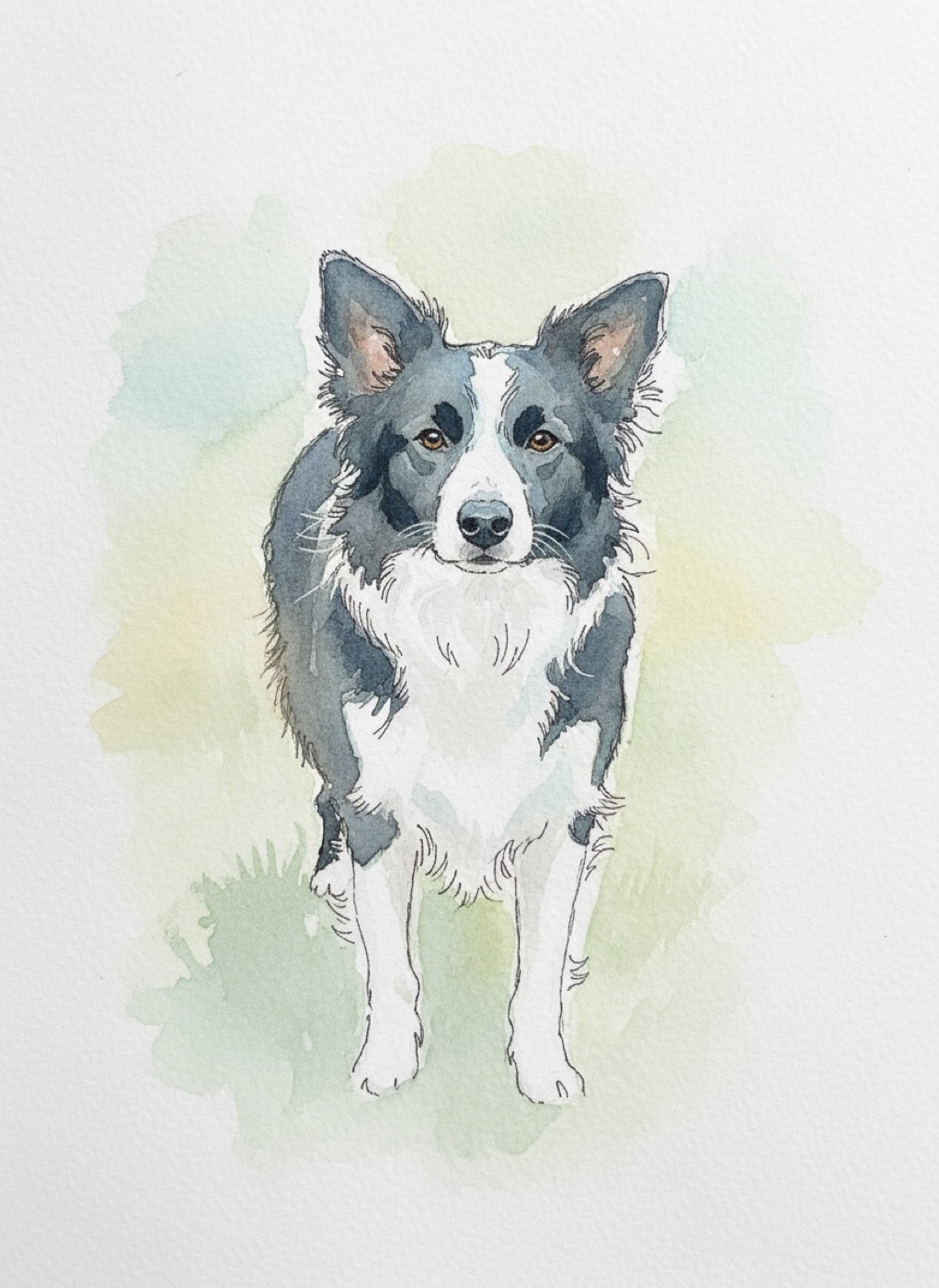 Style sample: Pepper, a border collie, in the Watercolor style
The samples above show two phone photos and the Watercolor portraits made from them. Notice how the rug behind Goldie and the grass behind Pepper almost disappear. That is typical: busy backgrounds in your photo do not matter much in this style.
Pets that look best in watercolor
Watercolor flatters some coats more than others.
White and light coats. The white paper becomes part of the fur, so a white chest, blaze or paws looks deliberate and elegant. Border collies are a good example; see the border collie guide for Pepper's full set.
Golden and cream coats. Warm washes suit a golden retriever's coloring beautifully. The golden retriever guide compares Goldie in Watercolor and Royal.
Fluffy and long coats. Soft edges suit soft fur. Long haired cats, doodles and spaniels look natural in this style.
Very dark coats can work, but they lose some of the lightness that makes watercolor special. For a black dog or cat, Royal or Pop Art may be the stronger choice; our Royal style guide shows how a dark background handles dark fur.
The right photo for watercolor
Because the style simplifies so much, it needs a clear face more than a perfect photo.
- Focus on the eyes. The ink lines are drawn where your photo has the sharpest detail. Sharp eyes give the portrait its life.
- Soft, even light. Harsh shadows turn into dark blotches in watercolor. Window light or shade is ideal.
- A simple pose. Sitting or lying with the head up reads clearly. Unusual angles can become hard to read once the detail is softened.
More tips are in our guide to the best photo for a pet portrait.
Watercolor next to the other styles
If you are choosing between styles, it helps to know what Watercolor gives up. It has less drama than Royal, less color than Pop Art and less storytelling than Storybook. What it offers instead is calm: a portrait that sits quietly in a room and rewards a closer look. Some homes pair a Watercolor in the bedroom with a bolder style in the living room.
Where watercolor portraits hang
Watercolor suits light, calm rooms: bedrooms, nurseries, kitchens, a reading corner. It pairs well with other art on a gallery wall because it does not shout. Many people choose it for a pet memorial for the same reason, it feels peaceful. Our memorial portrait guide talks about that choice in more detail.
Frame and size
| Frame | With Watercolor |
|---|
| White | The cleanest, most gallery like look, especially on a white or pale wall |
| Natural wood | Warm and relaxed, great in kitchens and bedrooms |
| Black | Crisp contrast, good on a colored wall |
The one inch white mat around each portrait blends into the white paper of the painting, which makes watercolor look especially good framed. Choose the 8 x 10 in size for a shelf, desk or nightstand and the 12 x 16 in size for a wall where it needs to be seen from across the room. The size guide helps you decide.
Updated October 8, 2026